Printing Services
Colour digital printing, photocopies, business cards, brochures, and much more.
Video Services
VHS & camcorder tapes to DVD, duplications, international video transfers, and more.
Business Services
Mailbox rentals, public fax services, cheques + deposit books, and much more.
Courier Services
Your independent agent for 11 courier services, packaging services, same day to Toronto, and more.
|
FAQs
We strongly recommend you prepare your file as a high-resolution PDF file with bleed. However, we also accept these other file formats: Adobe Illustrator AI and EPS files, Adobe Photoshop TIFF, JPG and flattened PSD files. Your files should always be in CMYK, anything else may result in a colour shift when other colour modes are converted into CMYK. For best results, the design file should start off as a CMYK colour mode. Images and artwork should be 300DPI. 1/8" bleed must be all around the file.
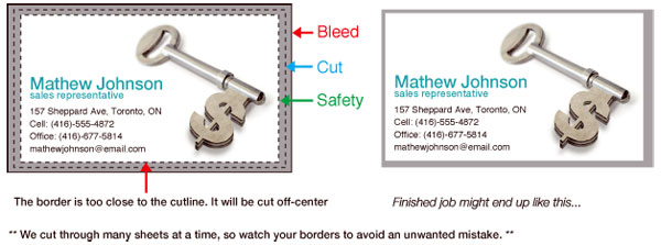
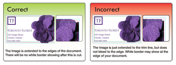
Bleed is critical in a file. Bleed is extended artwork on all sides
of the artwork to allow for cutter variance. Items such as background
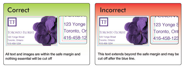
and design elements should always extend out of the trim margin. Safe Margins are 1/16"
away from the cut line. Safe margins are guideline borders which make
sure everything within the safe margins will not be cut off when trimmed
down to the final size. The file you upload to SinaLite must have font/imaged embedded or outlined, or else, we will not be able to process your file.
Tutorial on how to embed images Adobe Illustrator: Window > Links Choose the image you want to embed from the list and click on the arrow and select "Embed Image". Instruction on how to convert to outlines Select your text box. Under "Type menu" select Create Outlines. For products such as business cards, we would recommend customers to avoid borders. If the
border is too close to the cutline, it may results in the final product
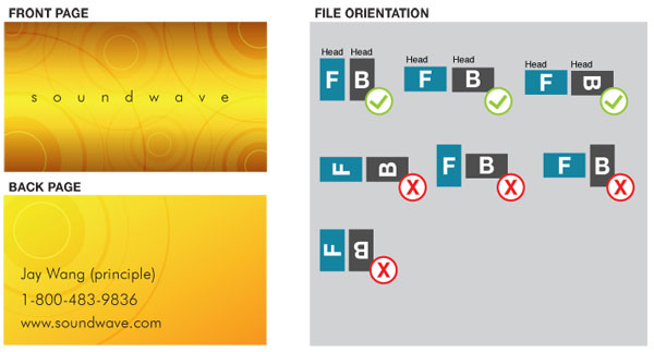
to be off-center slightly. In order to ensure files
are submitted properly for proper orientation, we will require files
to be submitted HEAD TO HEAD. SinaLite also requires to have files submitted
as one file, for example, a one sided file should consist of 1 PDF,
one page, and two sided file should consist of 1 PDF, 2 pages. We print using work and turn; therefore, files must be imposed properly
to back up properly. Here is a following example of how files should
be set: Overprinting refers to the process of printing one colour on top of another. If you do not want this to happen make sure that the overprint options are turned off and switched to knockout in your document. Below, the file was not switched to overprint, even though the white text is showed on screen, when printed, the white text did not show up due to overprint issues.
Please note that our file preview does not display overprint issues,
therefore, it is critical to check your file for overprint issues before
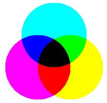
uploading the file to us. Transparency effects are generally not preferred in printing, and only on screen. It causes ripping issues and elements to disappear. To prevent this, do not use any shadow, glows and transparency on top of a spot colour - always convert your spot colour to CMYK before using any transparency effects. We are limited maximum ink coverage of 300%, anything over may result in many print related problems such as cracking. To achieve a rich black, we will recommend the values 30C20M 20Y 100K. We will always require 100% K for black text (C0, M0, Y0, K100). Rich black should not be used for type or thin lines because it will result in fuzziness and misregistration issues. Blues and Purples has always been a problem in the printing industry because the two colours are so close together in the CMYK spectrum. In order to ensure the two colours come up the correct tones, leave at least 15% differences in your Cyan and Magenta Values. (Example C100/M85/Y0/K0) For print to look blue, Cyan>Magenta by 15% For print to look purple, Cyan < Magenta by 15% Red and Orange are also problematic on press because the two colours are close together in the CMYK spectrum. In order to ensure the two colours come up the correct tones, leave at least 15% differences in your Magenta and Yellow Values. (Example C0/M100/Y85/K0) For print to look Red, Magenta > Yellow by 15% For print to look Orange, Magenta < Yellow by 15% Vector images use mathematical equations to define each component of an image. This allows vector images to retain their high-quality at any size. Programs like Adobe Illustrator, Corel Draw, or Adobe Freehand uses vector graphics. Vector images should be used for all text and logos if possible. They result in the clearest image and can be re-sized without losing resolution. A raster image is composed of a collection of tiny dots called pixels. When these pixels are small, and placed close together, they fool the eye into forming a single image. Raster images work great when subtle gradations of color are necessary. Because they contain a fixed number of pixels, a major disadvantage of raster images is that their quality suffers when they are enlarged or otherwise transformed. We would also recommend fonts and logos to be vector for print with maximum clarity. |

 .
.